

Editorial / Newsletter design
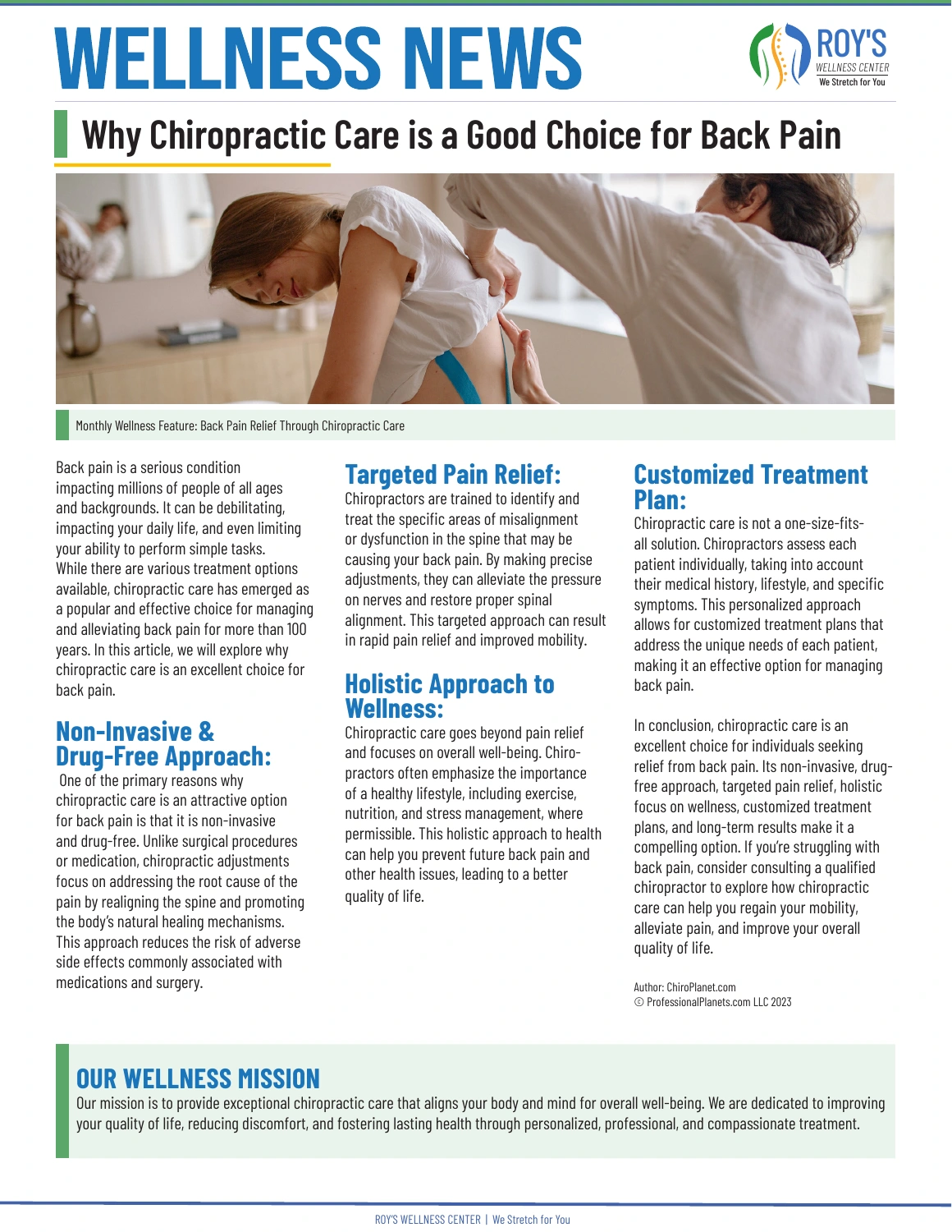
Wellness News
A one-page newsletter for Roy’s Wellness Center. I organized the content into a three-column grid, balancing a prominent masthead and photograph with readable article sections.
Adobe InDesign
My role & design decisions
My role: Layout, typography, color selection, image placement, hierarchy, spacing, and page organization.
Design decisions: A large blue masthead establishes the publication identity. The wide image introduces the feature, while repeated blue subheadings break up the article. Green accents connect the feature label and mission section to the branding.
Skills: Editorial design, grid systems, typography, branding consistency, and information organization.
My contribution is the newsletter design. Article credit: ChiroPlanet.com / ProfessionalPlanets.com LLC, as shown in the artwork.