Build the layout system
I established the grid, typography, sidebar treatment, headers, and footers before applying them across the publication.
01 / Editorial design
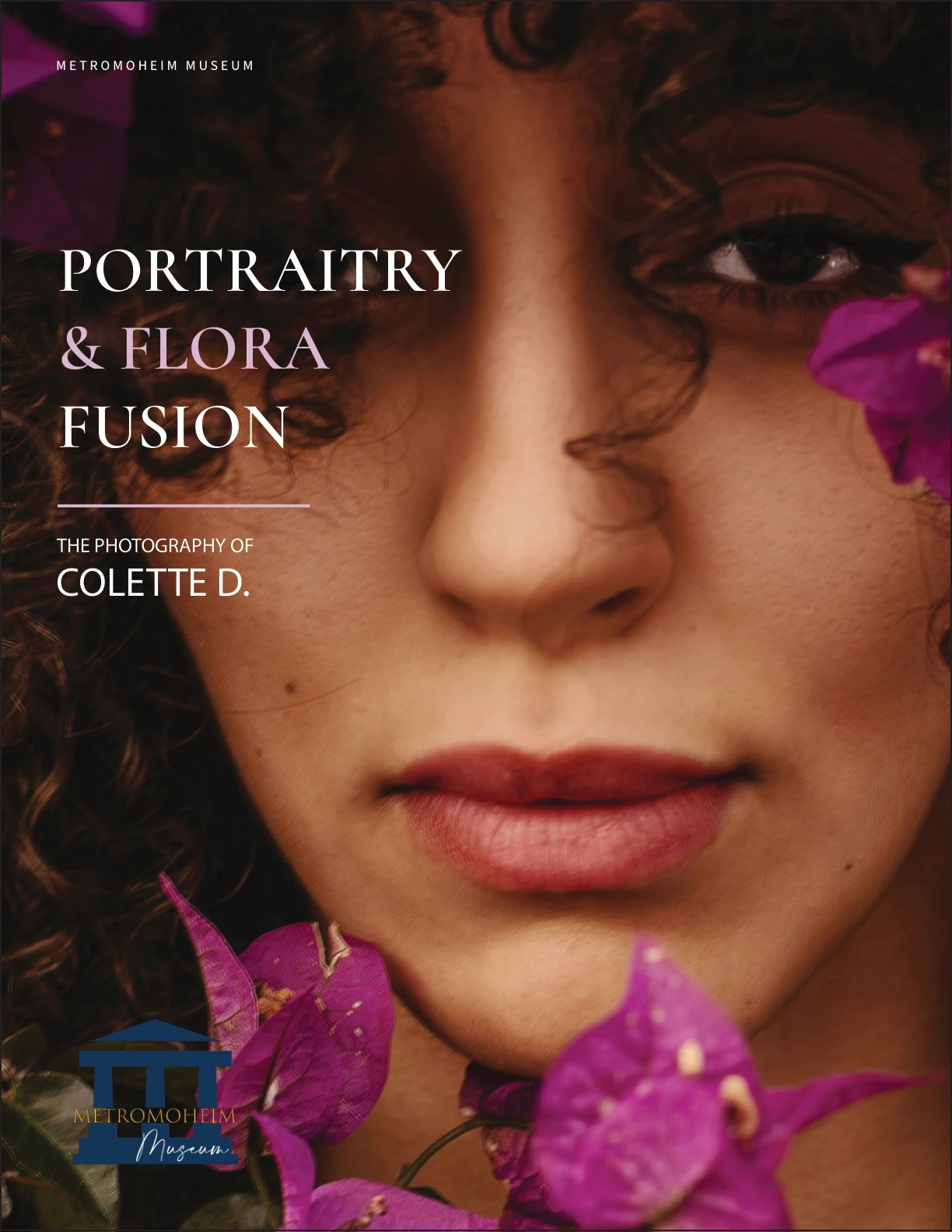
An exhibition publication exploring the relationship between portraiture and botanical imagery.
My contribution
Tools & workflow
Adobe InDesign · Acrobat / Distiller
Create an 8.5 × 11-inch portrait museum catalog that presents the exhibition artwork clearly and meets the booklet’s print-production specifications.
I built a three-column grid across facing-page spreads to organize artwork, captions, and exhibition content. A consistent typographic hierarchy and plum sidebar system connect the pages. Alternating compositions vary the pace without losing the publication’s structure.
How I developed the work
I established the grid, typography, sidebar treatment, headers, and footers before applying them across the publication.
I adjusted image placement, spacing, and column arrangements to balance the supplied artwork with supporting text.
I prepared saddle-stitch imposition and checked the 0.125-inch bleed, image resolution, font handling, and CMYK/color issues using InDesign and Acrobat/Distiller.
Inside the layout
The structure stays consistent while the imagery changes. This annotated final page shows how I organized a portrait, artist information, and longer reading passages.
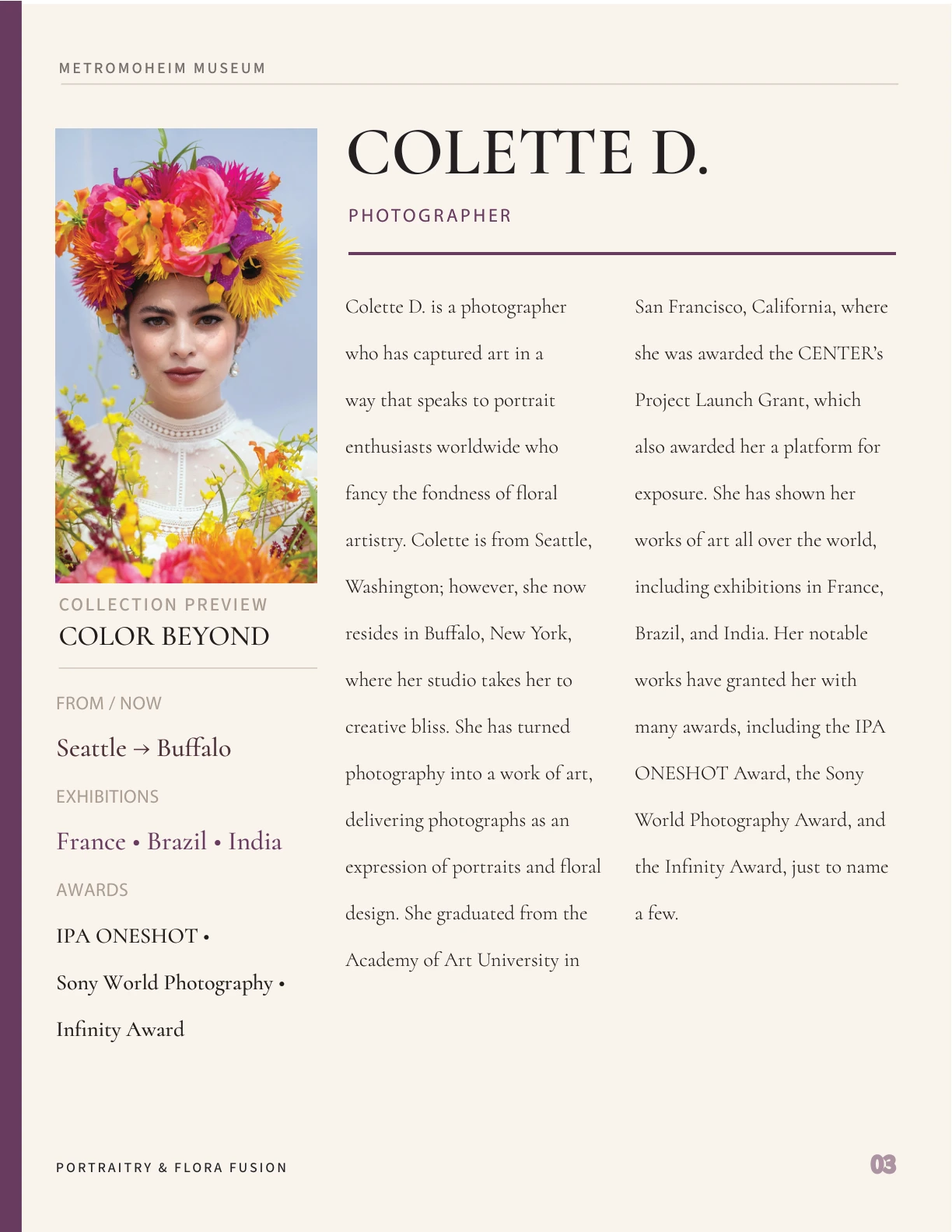
The portrait and quick facts occupy the left column. The biography uses the remaining two, giving different kinds of information their own space.
The oversized artist name leads, the plum role label follows, and the smaller body text supports sustained reading. Headers and footers keep the publication recognizable.
The edge stripe, rules, and accent text repeat a restrained color cue, connecting the page system without competing with the floral photography.
Guides are a portfolio explanation added to the final layout. Publication design and print preparation: Jessica M. Project photography and content: supplied or credited assets.
Visual direction
#F7F3EA#502F4B#24251FA presentation palette inspired by the supplied layout: warm paper, plum accents, and dark text keep the publication framework quiet beside vivid photography.
Open images to see the details
Assignment specifications, project content, and some artwork/photography were supplied or credited materials. I designed the publication layout and prepared the booklet for print.
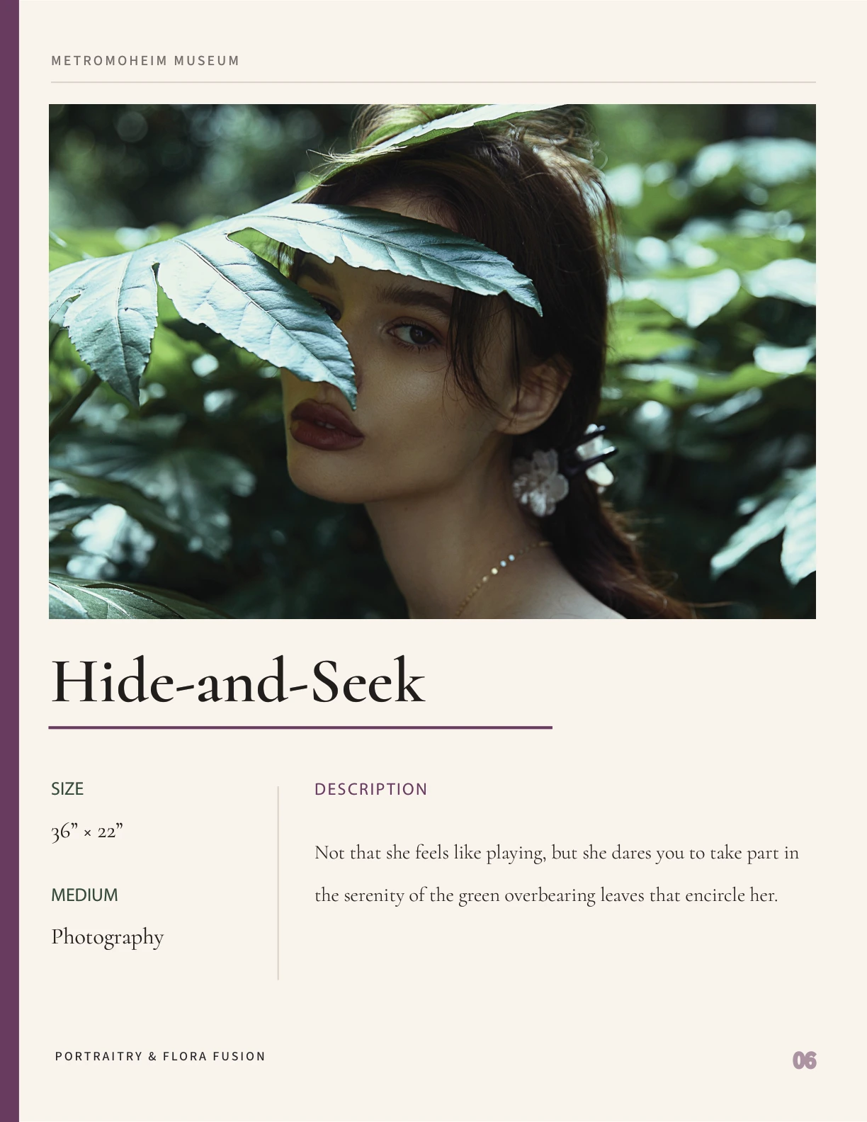
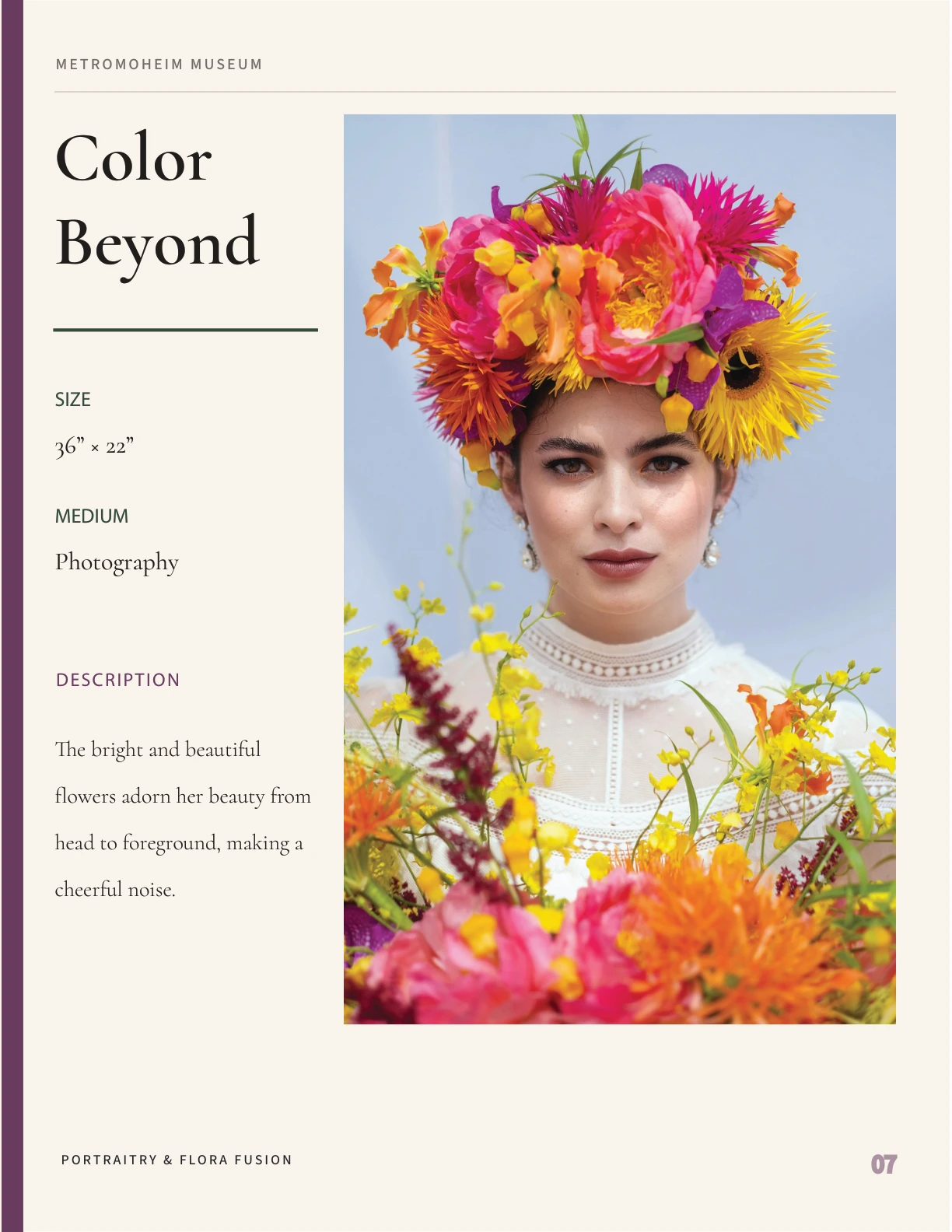
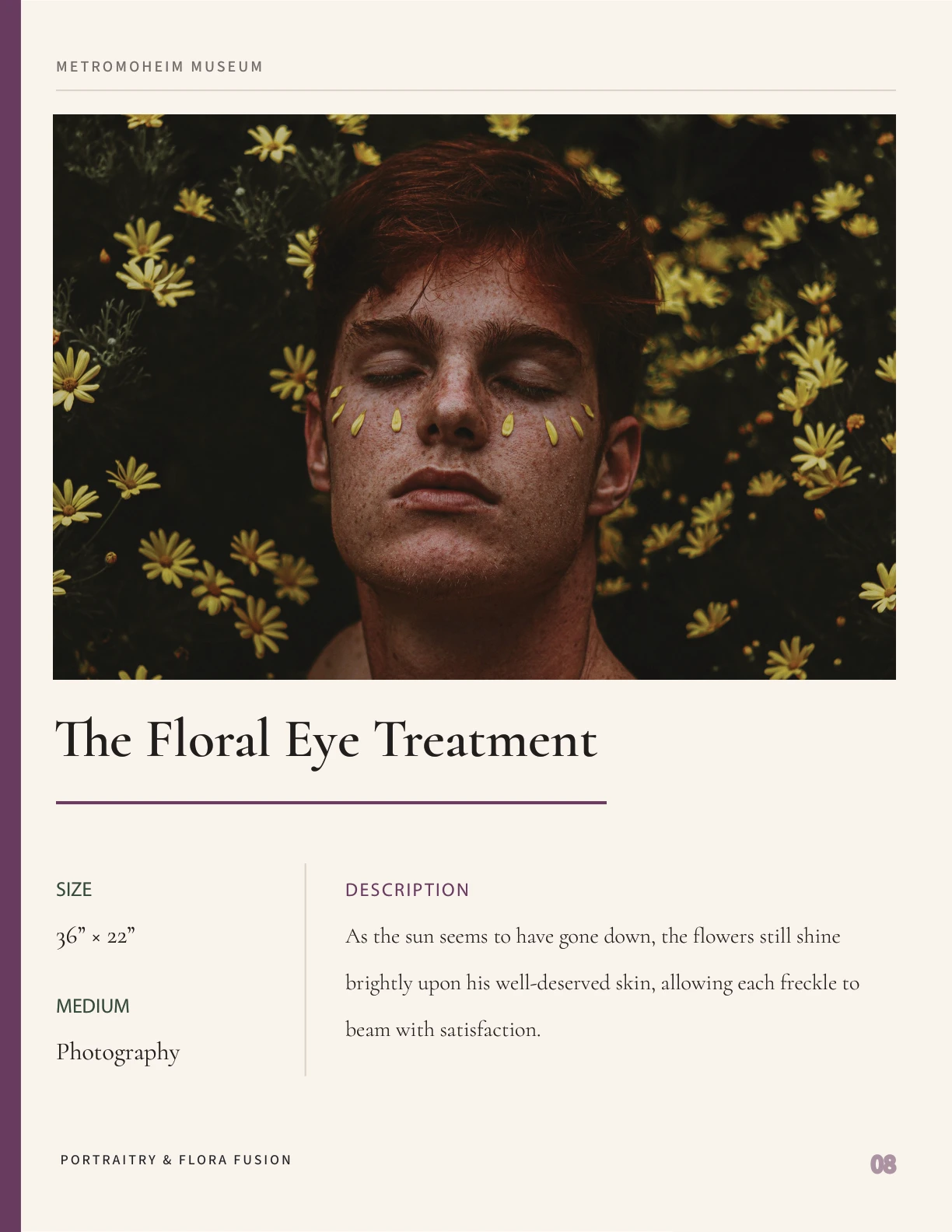
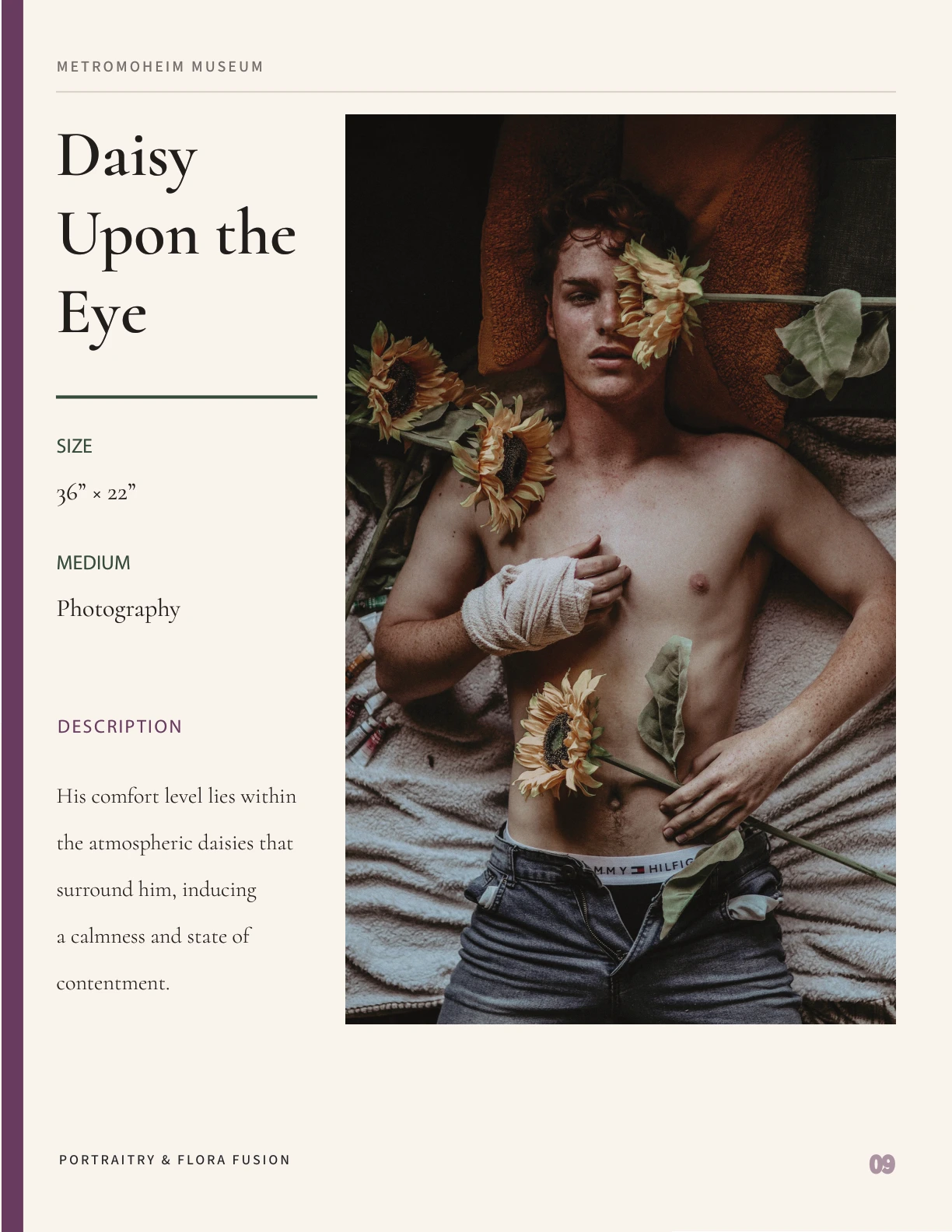
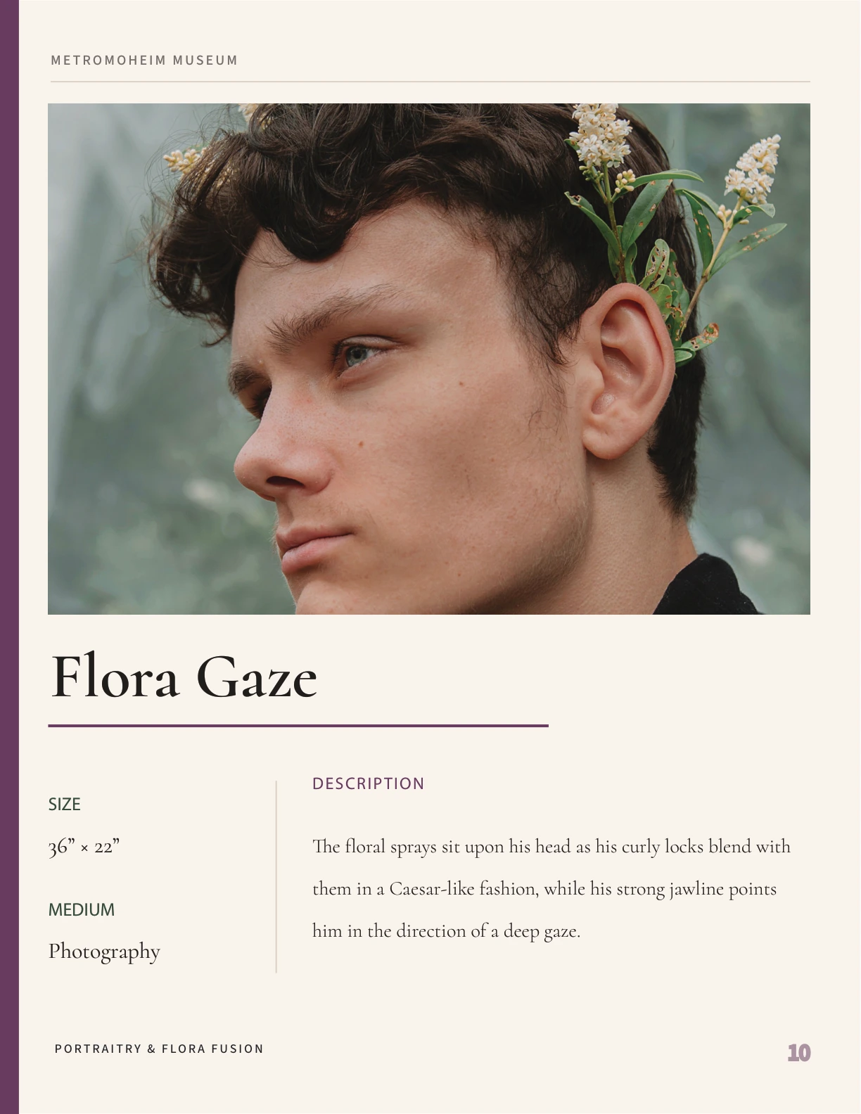
The final deliverable
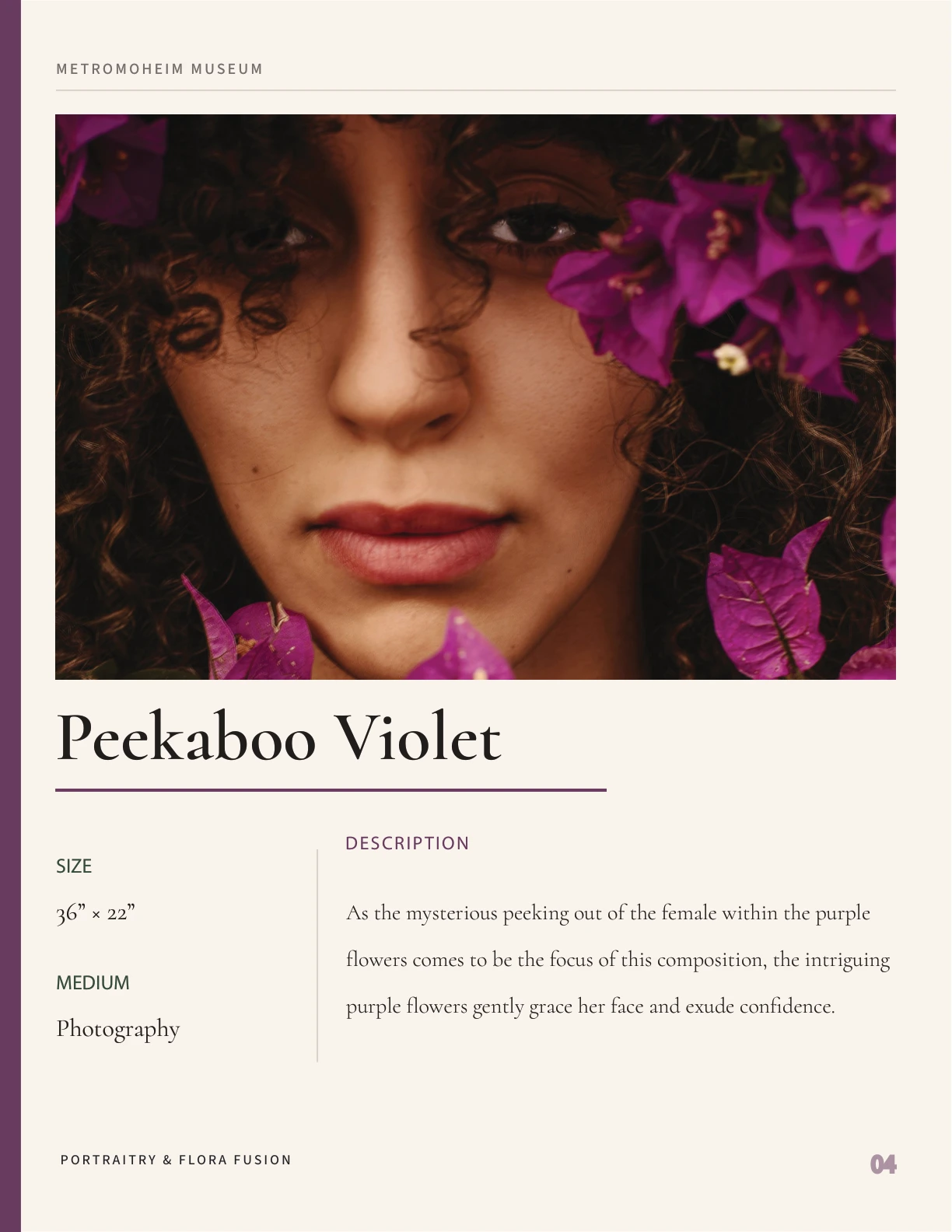
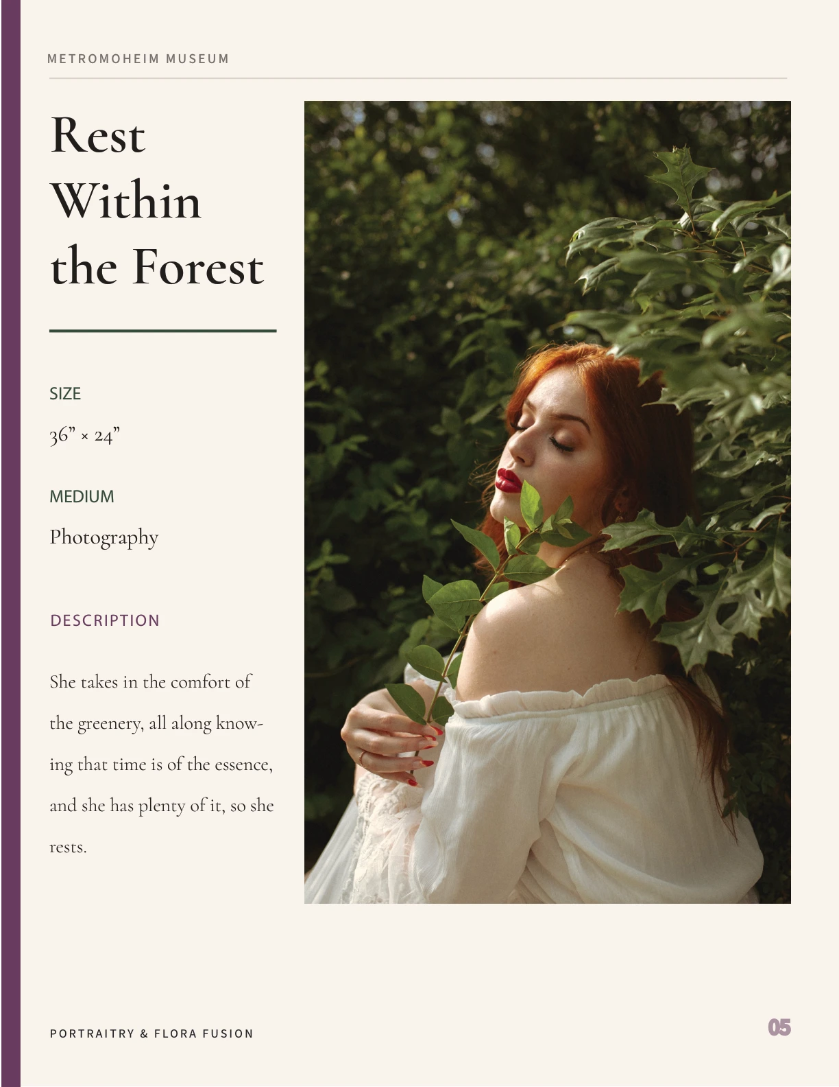
The final deliverable brings the catalog layout and print-production preparation together. Selected pages below show the recurring grid, sidebar system, and variations in composition.